When a filter has been selected, it will show as selected in various styles depending on the type of filter display options you have selected – checkbox, radio, list etc.
On top of this you have some extra options to show how these options are highlighted in your filters.
Table of Contents
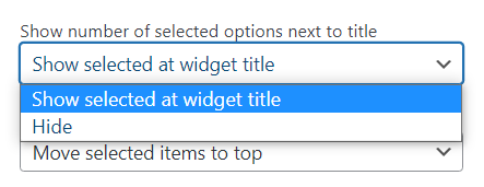
Showing the number of selected options next to title
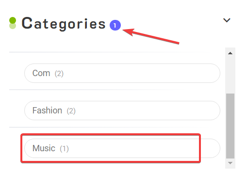
By enabling this, the number of selected options for each filter will display next to the filter title.
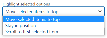
Highlighting selected options
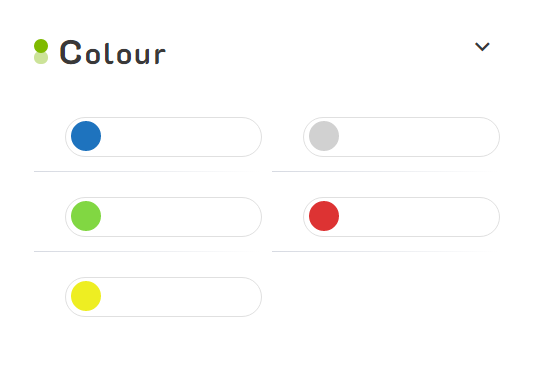
With these options, you can pick if your selected option moves to the top of the list, does nothing, or scrolls to the first selected item. For example, the default option of ‘Move selected items to top’, with green selected looks like this:
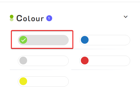
With green selected, you can see it gets shifted to the top of the filter to help highlight it and help users deselect it if they wish
Scroll to first selected item
If your filter has a scroll bar, you can choose the option ‘Scroll to first selected item’. Once an option is selected and the page/filter is reloaded it will automatically scroll down to your selection.
Stay in position
Of course, there is also the option to just do nothing at all. This will rely on the default style for the filter – e.g. checkbox, radiobutton, or just bold for lists.
